GRM Schedule
The images depicted on this page use the color palette and fonts from Astro 4. All new projects should use Astro 7 colors and fonts to be considered an Astro application. Refer to this section for general user experience guidance only, not visual design guidance.
Launch GRM Schedule Sample App | Design Materials and Source Code
Ground Resource Management (GRM) operations require ensuring that all the necessary equipment is available during the time windows when a target satellite is in range. Complicating this task is the fact that there are multiple simultaneous satellite contacts to manage, pieces of equipment that are shared amongst operational groups, and shifting priorities that can require a well-orchestrated schedule to be modified in-flight. Operators need to be able to monitor these impacts to the schedule and make the necessary modifications quickly to ensure that satellite operations can continue.
The GRM Schedule app is designed to allow operators to view and interact with the full schedule of contacts via a Timeline or List View. In addition, it allows the operator to manage the contacts in a single view, including the ability to add, view details, filter, modify, and delete contacts.
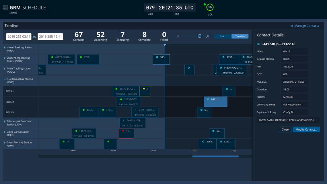
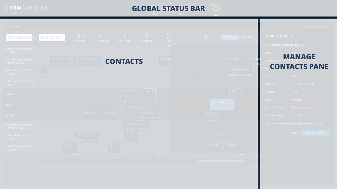
There are three main areas in the Schedule app: the Global Status Bar, the Contacts panel, and the Manage Contacts Pane. The key elements are described below, but you can find much more design and task flow detail in the GRM Design Specification and Wireframes documents. You can also launch the GRM Schedule Sample App to explore the design interactively.
Global Status Bar
As outlined on the About GRM Designs page, each of the apps in the GRM Suite is designed to occupy its own browser window, allowing operators to focus on the task at hand. But by virtue of being integrated into a suite, the apps share common functionality, such as a single login. Much of the shared functionality is provided in the Global Status Bar, an Astro component featured in all three apps. Though the status bar contents vary somewhat between apps in order to best support each app’s individual workflows, all contain a Clock, Monitoring Icons, and an app switching menu that allows operators to transition quickly from one GRM task flow to another.

- App Switcher Menu - The App Switcher Menu allows the user to launch new instances of different GRM apps, sign in/sign out, and edit preferences.
- Global Clock - Time is central to many GRM service task flows, so it is included in the Global Status Bar in all GRM apps.
- Monitoring Icons - The Dashboard app includes Upcoming Contacts Allocated (UCA) and Software status indicators, as well as status and alert counts for each of the top categories in the equipment hierarchy.
Contacts Panel
The GRM Schedule app presents operators with two alternative views of their contacts, a Timeline view or a List view. The Timeline view displays contacts as bars within a graphical layout with Ground Stations on the y-axis and time on the x-axis. The List displays contact data in a tabular format to facilitate quickly scanning multiple values and comparing values across contacts.
Timeline View
In the Timeline view, contacts are plotted by ground station and antenna on the y-axis and time on the x-axis. The contacts are represented as bars, the length of which indicates the duration of the contact. This design, which is based on the Astro Timeline component, provides operators with a consolidated view of the time and status for all recent, current and future contacts in their system. To allow operators to focus in on particular elements of interest, Ground Station rows can be expanded to show individual antennas, the timeline can be filtered by contact status, or zoomed in/out to focus on a particular time range.
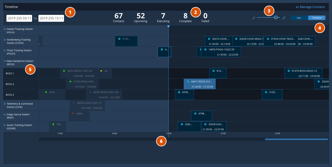
- Time Range Display - Displays the time range for the current timeline view.
- Top Line Data Aggregates - Displays total contacts and contact state counts.
- Zoom Controls - Allows operators to focus on certain time range by zooming the timeline in or out.
- View Toggle - Allows operators to switch between Timeline and List views.
- Ground Stations - Ground stations can be collapsed or expanded to display contacts by antenna.
- Playhead - Line marks current time with completed contacts to the left and future contacts to the right.
List View
The List view shares many of the elements of the Timeline view including the time range display, data aggregates, and view toggle controls. The main difference is that contacts are displayed in a tabular layout, which allows operators to see settings for contacts without having to click on them in the timeline. As such, it enables comparison of settings across contacts to show, for example, which ones share a particular element in an equipment string.
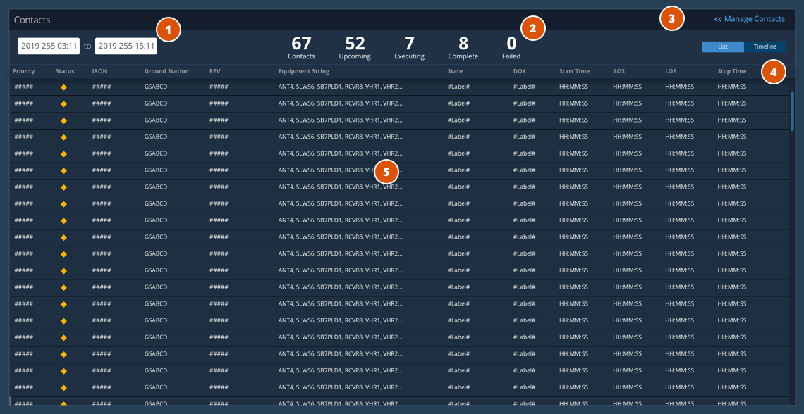
- Time Range Display - Displays the time range for the current timeline view.
- Top Line Data Aggregates - Displays total contacts and contact state counts.
- Manage Contacts Toggle - Opens the Manage Contacts Pane to filter or add contacts.
- View Toggle - Allows operators to switch between Timeline and List views.
- Contacts Table - Contacts are listed in a large data table.
Manage Contacts Pane
Operators can view additional detail on a contact by clicking on it in the timeline or row in the list view. This detail is presented in a Modeless Pane that draws in from the right side of the window so operators aren’t taken away from the main app view. The data in the pane is presented in read-only form initially, but a Modify Contact button swaps the read-only view for an editable one, allowing operators to change the contact’s settings. Similarly, to schedule a new contact, operators can click on the Add Contact button which opens the pane to specify settings.
The image below shows the Contact pane for this Add Contact task flow. To see the view contact and modify contact variants of the pane, and more design and task flow details, download the GRM Design Specification or Wireframes. You can also interact with these elements in the GRM Schedule Sample App.
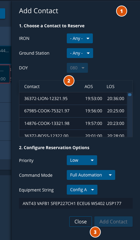
- Modeless Pane - The functionality to manage contact appears in a pane on the right side of the browser window that is collapsed when the task is complete.
- Contact Settings - The settings for the contact are specified using dynamic fields to guide the operator through the process.
- Action Buttons - Once the required values have been specified and the contact is added, the pane closes and a confirmation message is displayed.
Task Flow Example - Modify Contact
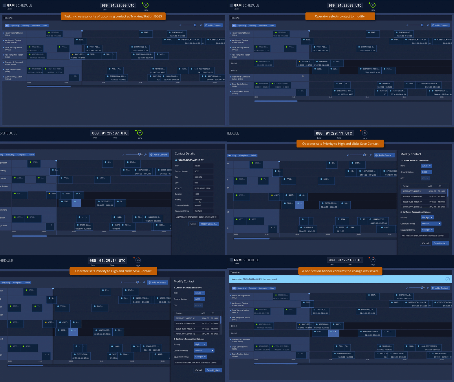
Below is an animated walkthrough of a representative task flow using the GRM Schedule app. In this scenario, an operator uses the GRM Schedule app to change the priority of an upcoming contact.
Design Materials and Source Code
Below are design and development resources to get you started on an app that supports GRM equipment management. Note that there are some discrepancies between the design documents and the GRM Schedule Sample App due to design improvements that were introduced late in the app development cycle.
| Resources | Description |
|---|---|
| GRM Design Specifications (pdf) | The GRM Design Specification contains information on use cases, task flows, UX research and wireframes for key features of the GRM App Suite. |
| GRM Design Wireframes (pdf) | The GRM Design Wireframes document contains the complete set of wireframes (mid-fidelity renderings) of the screens designed for the GRM App Suite. |
| App Source Code (Git Repository) | The source code Git repository and other useful documentation for the GRM Dashboard App is hosted at bitbucket.org so that you can check it out in detail. |

