The Global Status Bar is a full width view across the top of an application — an area commonly reserved for global status, global command and top-level navigation.
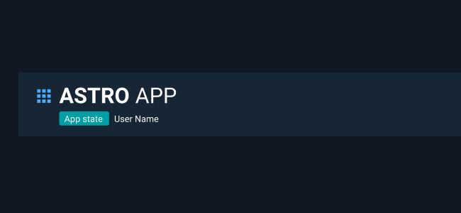
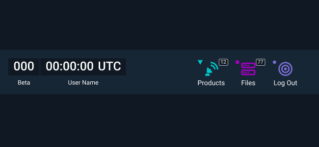
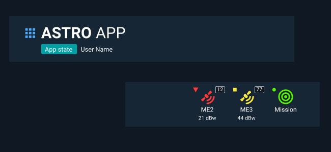
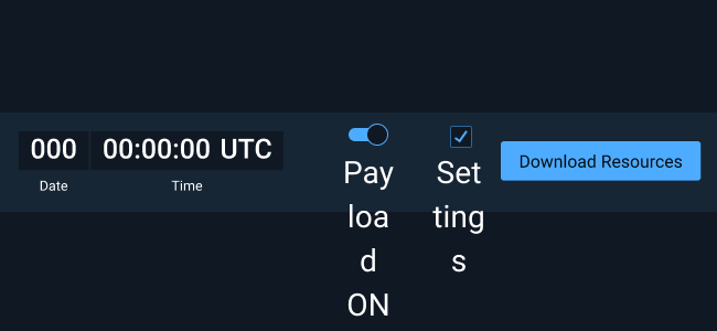
The Global Status Bar has four main parts: App Icon, App Title, App State, and Logged-in Username. Additional custom features can be added to the Global Status bar. Suggested elements include Clock, Monitoring Icons, and Buttons.
Simplest Global Status Bar - Only include the App Title.Standard Global Status Bar - App Icon, App Title, App State, and Logged-in UsernameComplex Global Status Bar - App Icon, App Title, App State, Logged-in Username, Clock, and Monitoring Icons.
When using the alternate light theme in Astro, the Global Status Bar and all of the elements it contains still use the default dark theme styling.
Do: Correctly and consistently utilize the standard elements that comprise the Global Status Bar.Don’t: Use icons, labels and colors incorrectly.Do: Left justify the application name. Additional custom elements should be centered in the Global Status Bar or right justified (when utilized).Don’t: Use the Global Status Bar for controls or indications that come and go with different app modes. Reserve it for truly global elements.