Classification & Control Markings
Classification and Control Markings are required for digital products created for government clients who interact with classified or controlled information. In your digital product, such as a desktop or web application, there should be an Overall Marking, Portion Markings if possible, and an Authority Block. Each of these features will be described in more detail below.
All Classification and Control Markings on this page are for illustration purposes only.
Official Requirements
This page lists general guidance and components for marking practices. For the most up-to-date policies, use the following resource links which should be considered the prime authorities for CNSI (Classified National Security Information) and CUI (Controlled Unclassified Information). In addition to these requirements, each government agency may have their own rules to use with those listed below.
Classified National Security Information
- ISOO Training Aids : Latest standards for CNSI from the ISOO (Information Security Oversight Office)
- ISOO Blog : Latest updates for ISOO topics including CNSI and CUI
Controlled Unclassified Information
- CUI Registry : Latest standards for CUI from the NARA
- CUI Blog : Latest updates for CUI including previews of upcoming policy changes
The guidance on this page is focused on the use of, and rules for, Classification and Control Markings in electronic application designs for government clients. Information about markings for emails, presentations, or other media (e.g. printed documents) can be found in the Additional Resources linked at the end of the page.
Overall Marking
Banner Examples
| State | Hex Value | RGB Value | CSS | Font Color | |
|---|---|---|---|---|---|
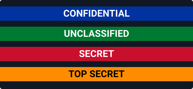
 | Unclassified | #007a33 | 0, 122, 51 | --classification-banner-color-background-unclassified | white |
 | Controlled (CUI) | #502b85 | 80, 43, 133 | --classification-banner-color-background-cui | white |
 | Confidential | #0033a0 | 0, 51, 160 | --classification-banner-color-background-confidential | white |
 | Secret | #c8102e | 200, 16, 46 | --classification-banner-color-background-secret | white |
 | Top Secret | #ff8c00 | 255, 140, 0 | --classification-banner-color-background-topsecret | black |
 | Top Secret//SCI | #fce83a | 252, 232, 58 | --classification-banner-color-background-topsecretsci | black |
Overall Marking Background Information
Applications used on government workstations with access to classified networks and information often do not have a full set of Classification Markings because the workstations themselves are already appropriately labeled. On the physical workstations, physical classification labels will be present showing the highest level of classified information the machine can access. The color of the physical classification label may also be apparent in the theme used in a workstation’s user interface when in use. The wallpaper of the desktop of the workstation often has an overall classification banner at the top of the screen that also marks the highest classification access of the machine and any additional caveats. There is not a banner at the bottom of the desktop wallpaper since it would be covered by the computer menus from the bottom of the screen. The Astro library provides a standardized Banner Marking for dynamic electronic systems to indicate the highest level of classification present.
Overall Marking Text
Text in the Overall Marking Banner should be as specific as possible to the highest level of classified information contained in that system or view. The banner message should follow the standard marking structure (placeholder text example: CLASSIFICATION//SCI//SAP//AEA//FGI//CUI//DISSEM) with bold, centered text in all capital letters. The classification level itself (excepting CUI) must be spelled out completely (example: UNCLASSIFIED instead of just U), but later caveats or Control Markings in the classification text can be abbreviated in their traditional formats or spelled out completely (example: SP-EXPT or SP-EXPORT CONTROLLED). CUI level marking banners can use CUI or the word CONTROLLED as the classification text. Only classification and/or control information in the standard format should be present in this banner. Supplemental administrative markings such as Draft should not be commingled into the Overall Marking Banner.
Overall Marking Placement
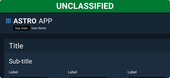
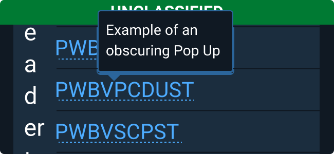
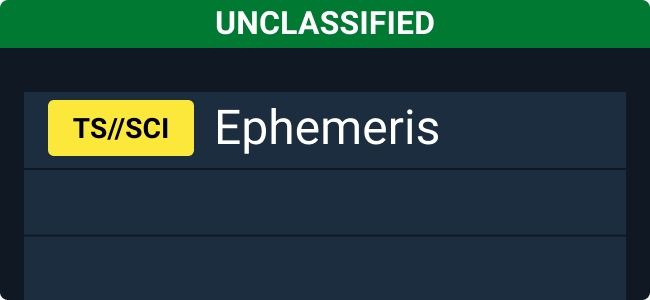
Place an Overall Marking Banner at the top and bottom of the application in a fixed position so that they cannot scroll out of view. Since the banner message can be quite long, we recommend that the banner span the full width of the application. This mimics physical classification markings, which span the full width of the document page. Note that a top banner is mandatory, but it is best practice to include an identical Overall Marking Banner at the bottom of the viewport as well.
Overall Marking Colors
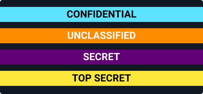
Astro banner component colors match what government users are familiar with in physical labels, their workstations, and other applications. Adding a colored background is not officially required by the government, but is culturally expected and does help with recognizing classification levels at a quick glance. Similarly, there are no particular color values required by the ISOO for specific classification levels for digital markings. The background colors for the banner components are based on the traditional Pantone colors used in the relevant Standard Form labels for SF 706 through SF 712 with the new addition of the purple CUI color from SF-902. The text colors for the banners are either white or black (the two text colors used on the physical labels) depending on which best contrasts with the background color. There is, however, a risk that the classification colors could create confusion when compared with similar colors used for status purposes, so the visual footprint of the banner has been reduced in Astro to the smallest recommended height.
Examples


Portion Marking
Tag Examples
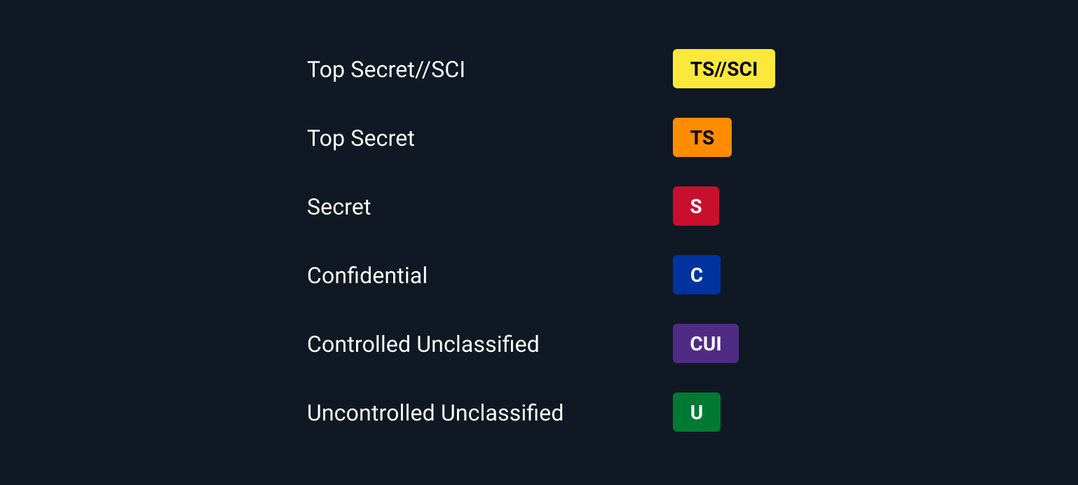
Portion Marking Background Information
Proper Portion Marking is critical to reduce classification problems and leaks. It is equally important to show which portions are Uncontrolled Unclassified Information to enable better communication between teams and teammates with different levels of security clearance. A ‘portion’ is anything in a document that has a separate classification from other elements of the document.
For those developing applications/websites, there are specific rules about Portion Marking file names, URLs, and metadata. To learn more about these aspects, review the requirements in the relevant Additional Resources.
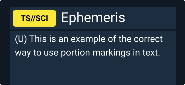
Current policies require Portion Marking throughout a document, but, in practice, Portion Marking is often left to section markings at best. At a minimum, include section markings using the standard abbreviated text format in parentheses or other enclosed format, such as a Tag, if the classification information is available. Give serious consideration to adding Portion Marking to individual fields with drastically different classification levels or to move higher classification items to a separate section if the new grouping is still consistent with the user’s mental model and the UI organization. If relevant, the information could also be portrayed in a separate column in a table for each item’s row (preferably in an immediately visible location). In this case, the parentheses should no longer be necessary as the column division should provide enough differentiation from the rest of the table text.
There are few exceptions to Portion Marking requirements, but the ISOO does acknowledge that different types of documents such as “dynamic documents,” a category that many applications or databases fall under, may have difficulty with these requirements. If a document is not portion marked fully and the classification/control level is higher than CUI, the responsible agency for the application may need to obtain a waiver from the ISOO and will need to indicate on the document that it cannot be used as a derivative source document.
Portion Marking Text
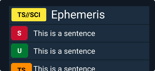
Portion Markings should be bold, all capital letters and abbreviated within parentheses like (CUI//SP-EXPT) or within a Tag as seen in the components pictured above. They can also be spelled out in full, if needed, however this method should be avoided for longer text strings. Note that control markings such as SCI, SAP, AEA, CUI, or dissemination are also required in Portion Markings if they are relevant to that portion.
Portion Marking Placement
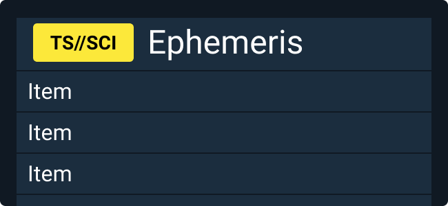
Portion Markings should be placed at the top or top-left of the classified or controlled portion. Astro recommends using the tag version of Portion Marking if the markings are at a higher section or card level. For more in-line text portions or portions lower in the visual hierarchy of the User Interface, use the text-only version.
Portion Marking Colors
The colors used in the Tag components are the same as those in the Overall Banner Markings for easy recognition.
Examples


Authority Block
Authority Block Guidelines
Whenever classified or controlled information is present, use an Authority Block, to trace the source of the designation and any necessary clarifications about declassification dates or classification reasons. The Authority Block is typically in the bottom left of a document page, but can be placed elsewhere according to layout needs. Similarly, if necessary in the layout, the authority information for electronic material may appear as a single line of text instead of the typical three-line approach. Note that there is a slightly different structure for CUI, originally classified documents, and documents with a classification derived from another document. Authority Blocks are most often displayed as lines of text and do not currently require a component to satisfy this marking requirement. To learn more about this element, go to our Additional Resources.
| Do |
|---|
| Show the source of classified or controlled information on a page with relevant contact information. |
| Clarify if the classified information is originally classified or derivatively classified from another document. |
Additional Resources
Classified National Security Information
- ISOO Training Aids: Latest standards for CNSI from the ISOO
- ISOO Marking FAQs
- ISOO Blog: Latest updates for ISOO topics including CNSI and CUI
- CDSE: Information Security
- At Ease Computing, Inc. Online Store - U.S. Government Security Labels (SF)
Controlled Unclassified Information
- CUI Registry: Latest standards for CUI from the NARA
- CUI Blog : Latest updates for CUI including previews of upcoming policy changes